couleur complémentaire
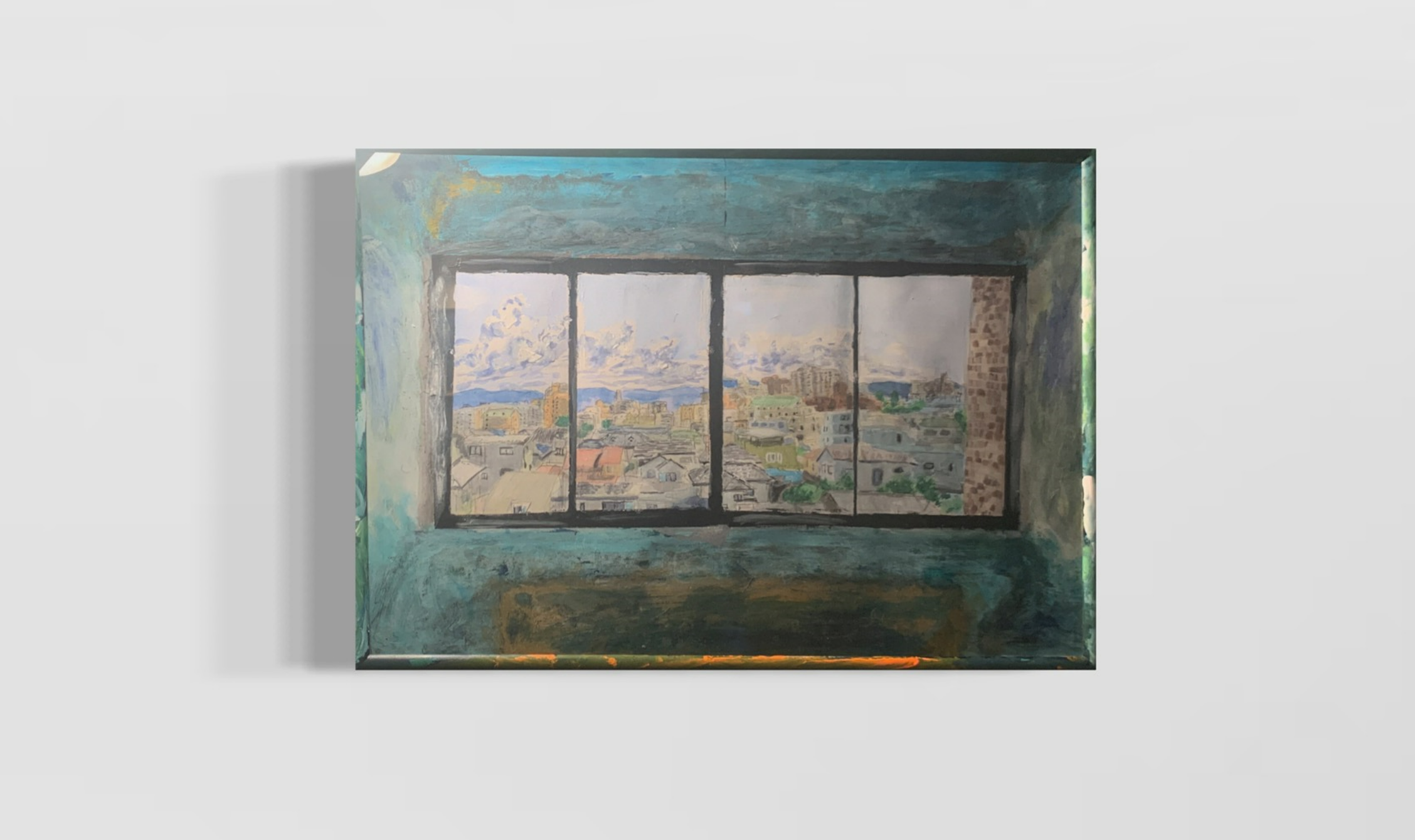
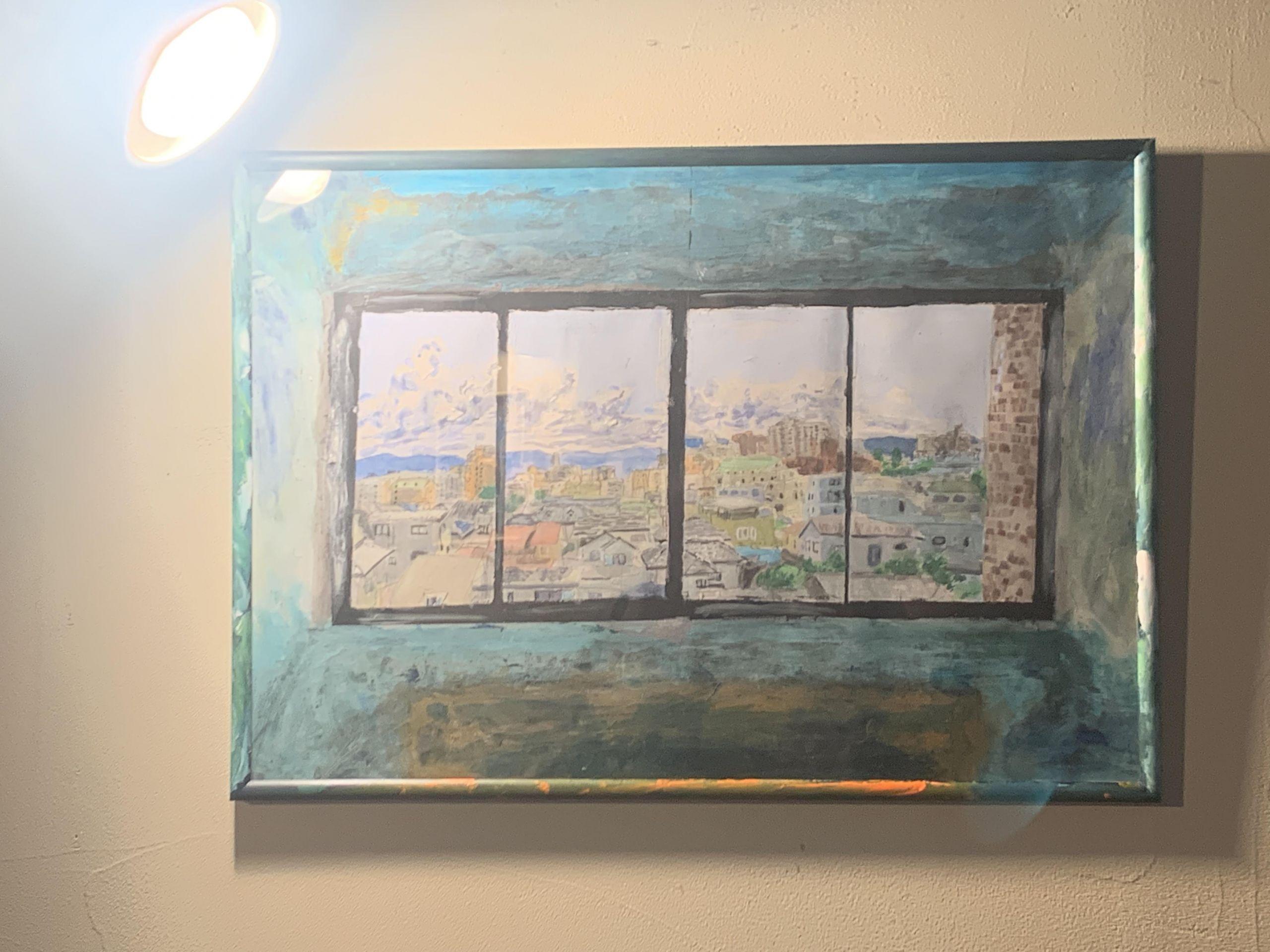
CATEGORY
DIMENSIONS
54.00x39.00
YEAR
2021

TECHNIQUE
Another effect of complementary colours is that if you keep looking at one colour, its complementary colour will appear as an afterimage. It is said that the reason doctors wear green during surgery is to protect against eye problems caused by looking at

PRICE
Not for sale
ABOUT THE WORK
Material: acrylic ,waterpainting
≪couleur complémentaire≫, painted in August 2021, was inspired by the Polish artist Władysław Strzemiński. I knew him from Powidoki, the... Read More