Fátima Frade Reis
Lives and works in Lisbon, Portugal.
Education
Individual Project in Visual Arts at Ar.Co – Centro de Arte e Comunicação Visual, Lisbon (2016/2017);
Advanced Course in Visual Arts at Ar.Co – Centro de Arte e Comunicação Visual, Lisbon (2014/2016);
Regular Course in Painting and Drawing at Ar.Co – Centro de Arte e Comunicação Visual, Lisbon (2011/2014);
Group Exhibitions
Biennal JCE / Jeune Creation Europeenne 2019/2021, Montrouge, Paris, France, 2019;
Young Art Award Millennium BCP 2019/ Prémio Arte Jovem Millenium BCP - Carpe Diem, Lisbon, 2019;
"Ar.co - Bolseiros e Finalistas'16 +17", Hub Criativo do Beato, Lisbon 2017;
"Ar.Co - Exposição de Outono / Open studio", Quinta de São Miguel, Almada 2016;
"Ar.Co - Exposição de Outono / Open studio", Quinta de São Miguel, Almada 2015;
"Ar.Co - Exposição de Outono / Open studio", Quinta de São Miguel, Almada 2014;
Artistic residence and exhibition, Carpe Diem, Lisbon 2013.
Individual Exhibitions
“Tecer o espaço”, National Museum of Costume, Lisbon, 2019-2020;
“Linha e cor”, Silk and Territory Museum/ Museu da Seda e do Território, Freixo de Espada à Cinta, 2019;
“Cruzar e dobrar”, Auditório Municipal de Freixo de Espada à Cinta, 2019;
"A Rota da Seda", work with Katie Lagast, Centro Cultural de Macedo de Cavaleiros, 2018;
"Cruzamentos", work with Katie Lagast, Espaço AZ, Lisbon, 2018;
"Nem de um tipo nem de outro", Geological Museum of Lisbon/ Museu Geológico, Lisbon, 2018.
Work description
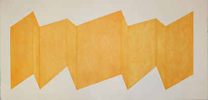
The engraving work that Fátima Frade Reis develops has allowed a great experimentation of color.
She is also interested in using drawing as a form of expression and basis of the execution process.
The ink stains left by the engraving on engraved lines from the plate to the paper and overlaid with others that are perpendicular to it, make varying vibrations and use them to create
multiple colors and shifting that binds to create unique multicolored panels. These color variants allow you to approach spatiality. It gives relevance to the choice of paper, as it will enable several textures that it is
discovering and that are being imposed. Using soft colors and media like Japanese paper creates a sense of serenity through translucent, sometimes transparent images.